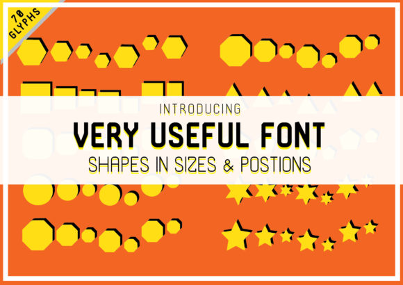
Very Useful: A Dingbats Font That Turns Shape Into Function
Fonts do more than spell words—they shape perception, convey tone, and even solve design problems. Very Useful stands apart not as a text typeface, but as a purpose-built dingbats font: a curated collection of bold, expressive shapes designed for immediate visual utility. Unlike decorative symbol sets that prioritize whimsy or abstraction, Very Useful merges clarity with versatility—each glyph is intentionally crafted to serve real-world communication needs.
What Makes Very Useful Different?
At its core, Very Useful is a response to a common creative bottleneck: the need for clean, consistent, scalable icons and visual markers that don’t require illustration skills, licensing checks, or complex vector editing. It’s not an icon library in the traditional sense—it’s a font. That means every shape behaves like text: resizable without pixelation, colorable with CSS, keyboard-accessible, and embeddable across platforms with minimal overhead.
The collection includes over 120 glyphs—arrows that point with intention, dividers that guide layout flow, checkmarks and crosses built for clarity at small sizes, geometric frames, directional cues, and abstract yet intuitive forms. What unites them is a shared visual language: high-contrast outlines, generous spacing, and balanced weight distribution. No glyph feels cramped or overly ornate. Each one holds its own—even at 14px on a mobile screen.
Designed for Utility, Not Just Aesthetics
“Dingbats” often evoke retro clip-art or dated symbols—but Very Useful redefines the category by centering function. Its shapes are tested for legibility, scannability, and contextual flexibility. For example:
- An arrow isn’t just left-facing—it’s optimized to pair with labels, align cleanly in grids, and remain distinguishable when inverted or rotated.
- A dot isn’t generic—it comes in three calibrated sizes (small, medium, large) to support hierarchy in lists, timelines, or progress indicators.
- Even “abstract” shapes—like nested circles or angular brackets—serve as visual anchors for callouts, section breaks, or modular UI elements.
This isn’t symbolism for symbolism’s sake. Every glyph in Very Useful answers a question: What does this need to do—and where will it be seen?
Who Benefits Most from Very Useful?
Very Useful shines where speed, consistency, and accessibility intersect. It’s especially valuable for:
- Content creators and educators building presentations, handouts, or learning modules—using simple shapes to highlight steps, separate sections, or visualize relationships without cluttering slides with external assets.
- Small business owners and marketers designing social graphics, email headers, or landing page elements—adding visual rhythm and emphasis using only native text tools (Canva, Google Docs, Mailchimp).
- Web developers and designers implementing lightweight, performant icons—replacing SVG sprite sheets or icon fonts with a single, well-hinted WOFF2 file that loads instantly and respects user preferences (e.g., reduced motion, forced colors).
- Writers and editors working in plain-text environments (like Markdown editors or CMS backends) who want subtle, semantic visual cues—bullets that mean “priority,” dividers that imply “pause,” or brackets that frame quotes with intention.
It’s also quietly powerful for accessibility-first workflows. Because Very Useful glyphs are font-based, they inherit text properties: they scale with browser zoom, respond to high-contrast modes, and can be paired with ARIA labels when used meaningfully (e.g., a checkmark glyph inside a with aria-label="Completed").
Real-World Uses You Can Try Today
You don’t need a design system overhaul to benefit from Very Useful. Here are practical, low-lift applications:
- Email signatures: Replace generic bullet points in contact lists with custom arrows or dots—consistent across Outlook, Gmail, and Apple Mail.
- Documentation headers: Use angular brackets or double bars as section dividers in README files or internal wikis—rendering cleanly in both rendered HTML and raw Markdown previews.
- Print-ready checklists: Combine Very Useful checkboxes with CSS counters to generate printable, accessible task lists—no images, no JavaScript.
- Dashboard annotations: Add directional arrows or focus frames directly in CSS-generated content (e.g.,
::beforepseudo-elements) to guide user attention without bloating bundle size.
What It Doesn’t Do—And Why That Matters
Very Useful isn’t trying to be everything. It doesn’t include pictographic icons (no “cloud”, “envelope”, or “settings” glyphs). It avoids realism, gradients, or multi-layered compositions. And it doesn’t offer stylistic alternates or variable axes.
That restraint is intentional. By focusing exclusively on bold, functional shapes—not illustrations—Very Useful stays lightweight (<50KB), predictable, and interoperable. It doesn’t compete with comprehensive icon systems like Font Awesome or Feather Icons. Instead, it complements them—serving as the quiet foundation for structure, rhythm, and spatial logic while those libraries handle representational meaning.
Evaluating Fit for Your Project
Before adopting Very Useful, ask yourself:
- Do I need symbols that behave like text? If your workflow relies heavily on copy-paste, CMS fields, or plain-text editing, font-based symbols reduce friction significantly.
- Is visual consistency across devices non-negotiable? Very Useful renders identically in Safari, Chrome, Firefox, and Edge—no fallback concerns, no blurry raster icons on Retina screens.
- Am I optimizing for performance or simplicity? One HTTP request replaces dozens of SVGs. No build tooling required—just load the font and start typing Unicode values or using ligature shortcuts.
- Do my users rely on assistive tech? When paired with proper semantics, Very Useful glyphs enhance—not hinder—accessibility, unlike unlabeled inline images.
If most answers are “yes”, Very Useful likely fits. If you need photorealistic icons, brand-specific illustrations, or animated interactions, look elsewhere—but consider layering Very Useful underneath for structural clarity.
A Tool That Grows With Your Needs
Many fonts fade after initial use. Very Useful deepens in value over time. Designers discover new combinations—a bracket + dot + arrow creates an elegant step indicator. Developers build reusable CSS mixins. Writers develop typographic shorthand for recurring concepts.
Its strength lies in repetition with variation: the same arrow glyph works in a timeline, a navigation bar, and a footnote—each time feeling intentional, never repetitive. That’s the mark of true utility: not flash, but reliability. Not novelty, but nuance.
In a digital landscape saturated with disposable assets, Very Useful offers something increasingly rare: a focused, thoughtful, and deeply practical tool—one that doesn’t shout for attention, but consistently earns trust through quiet, everyday usefulness.